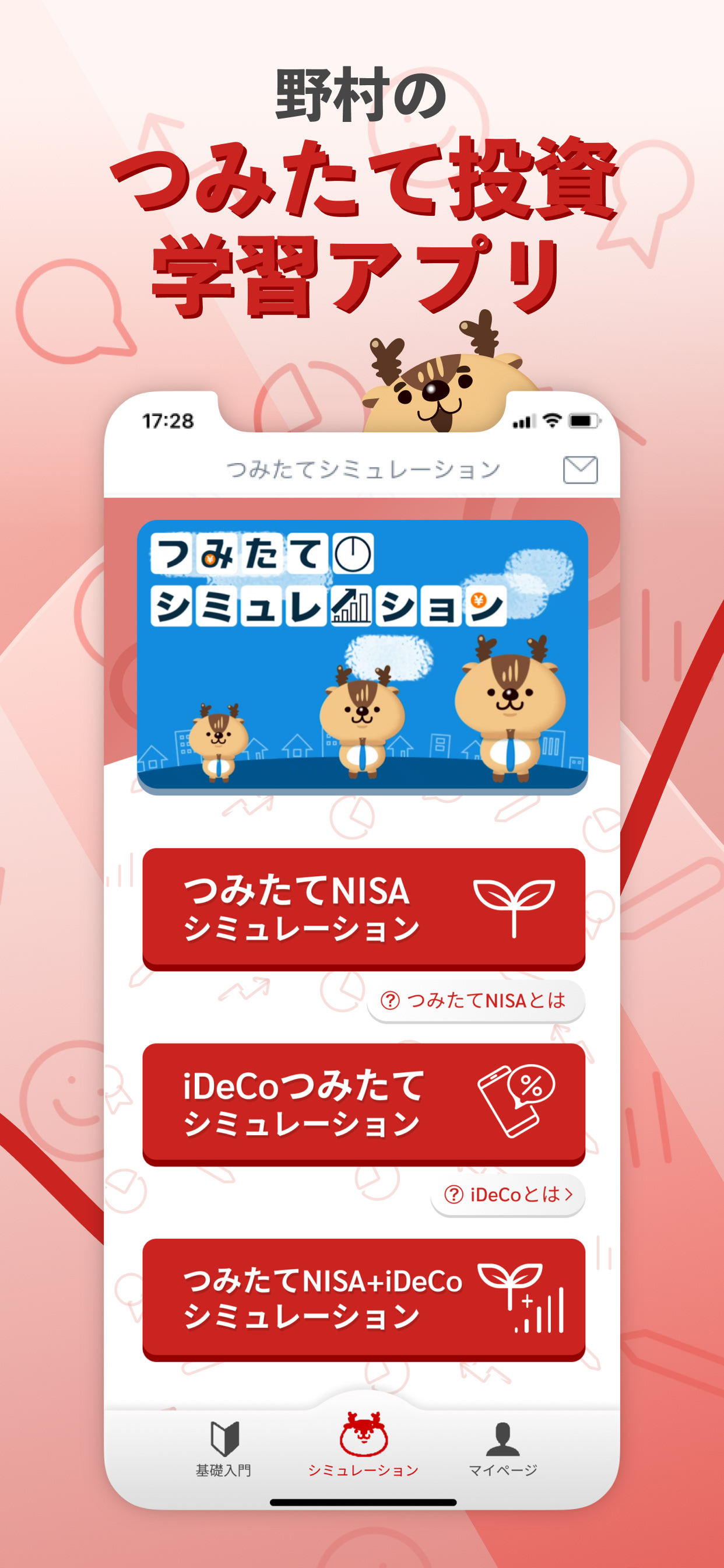
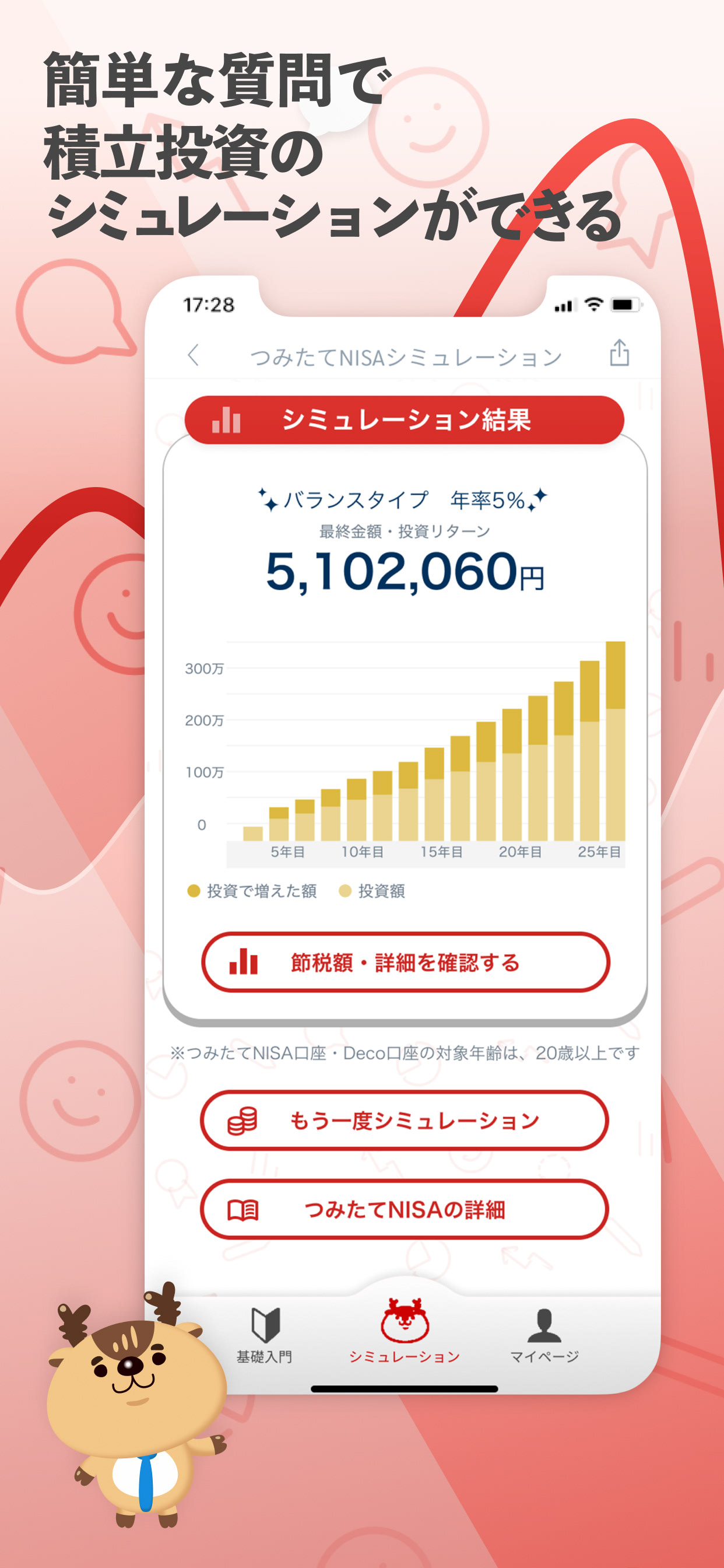
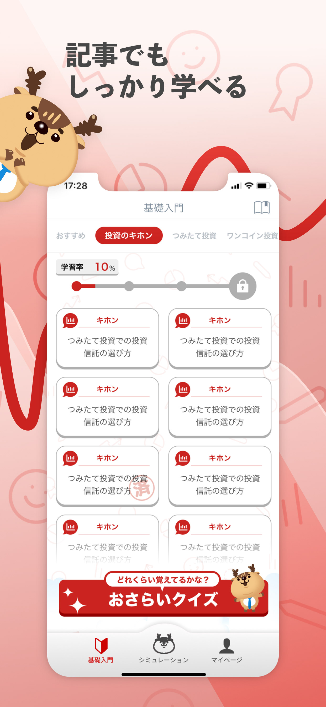
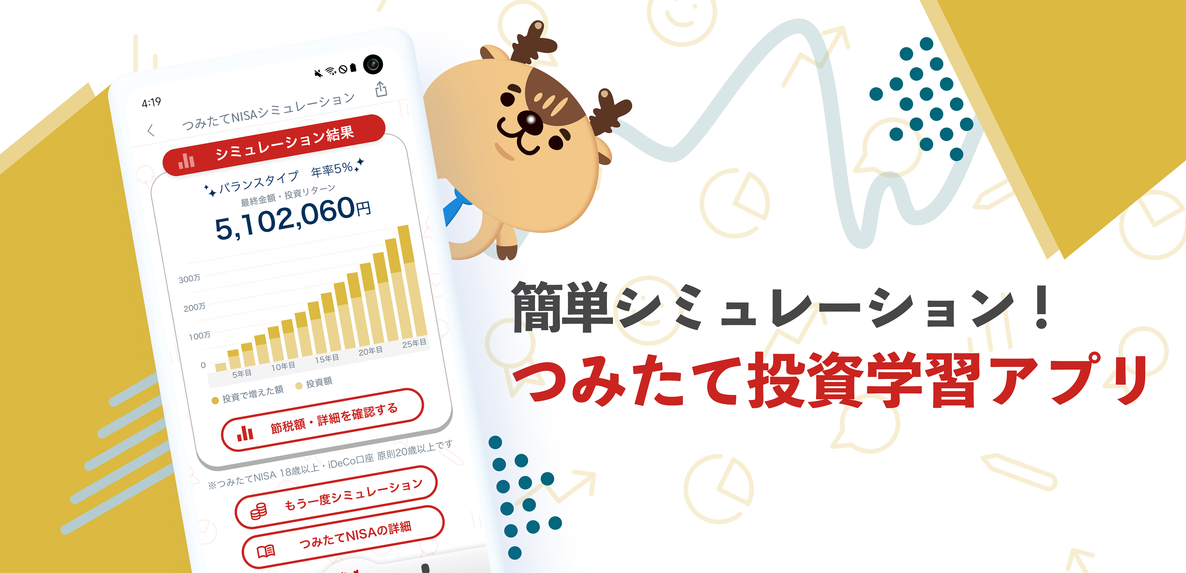
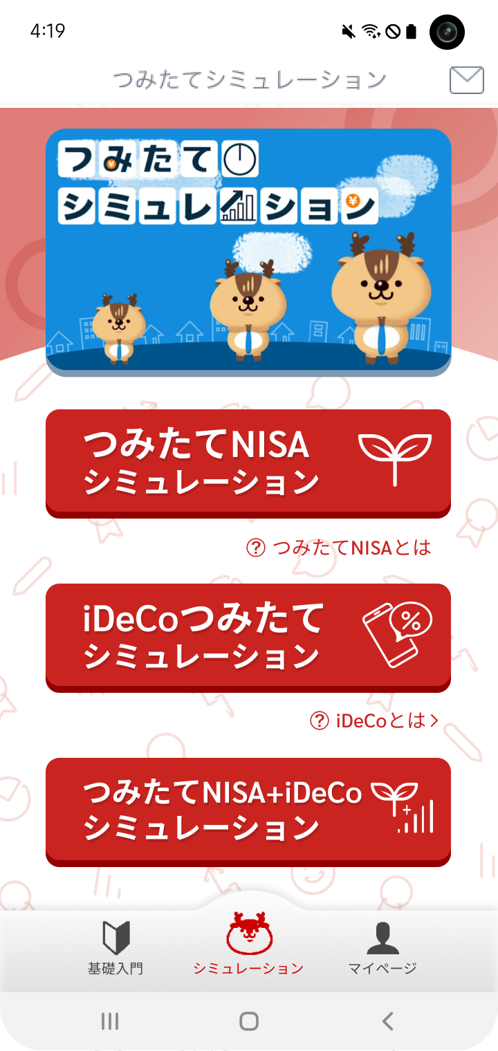
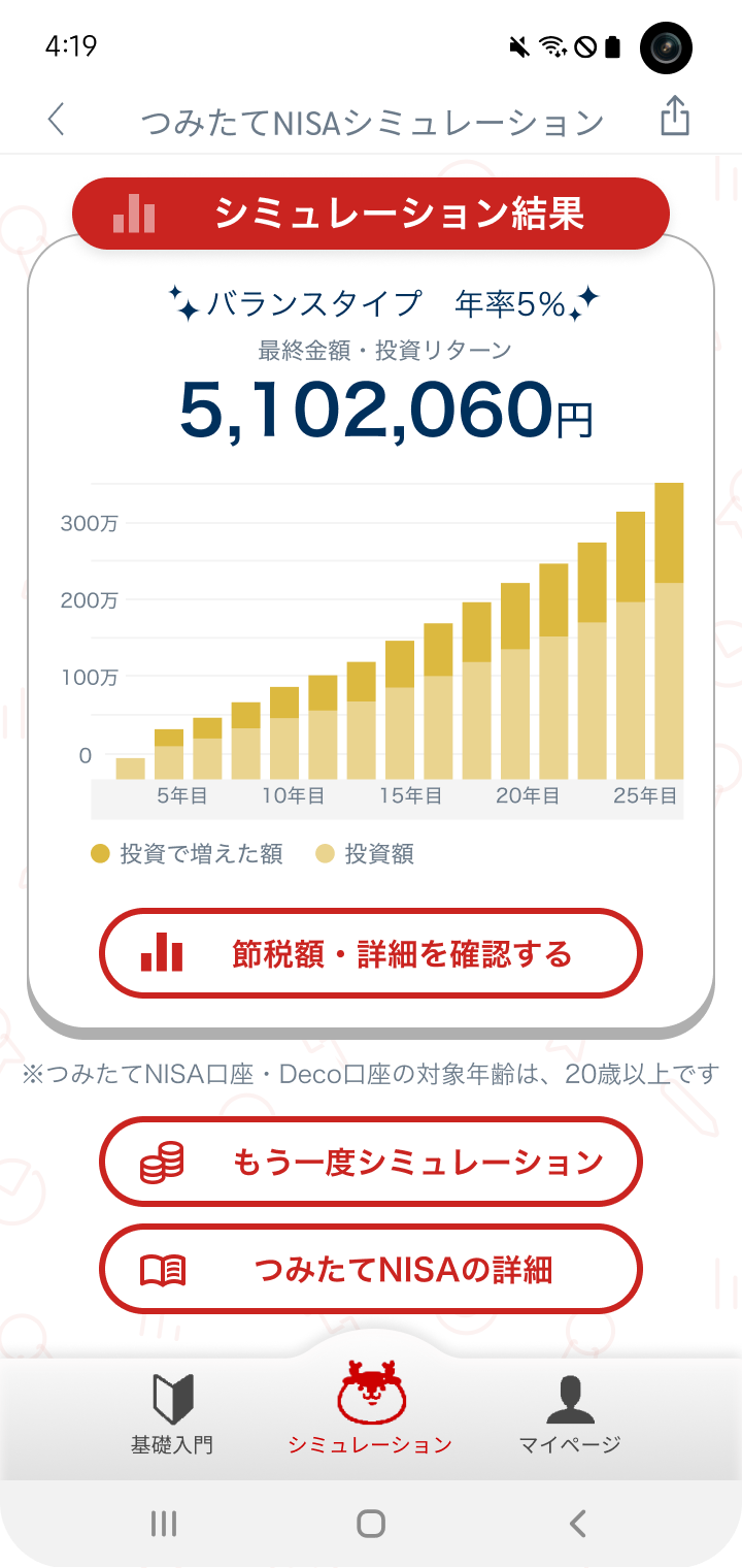
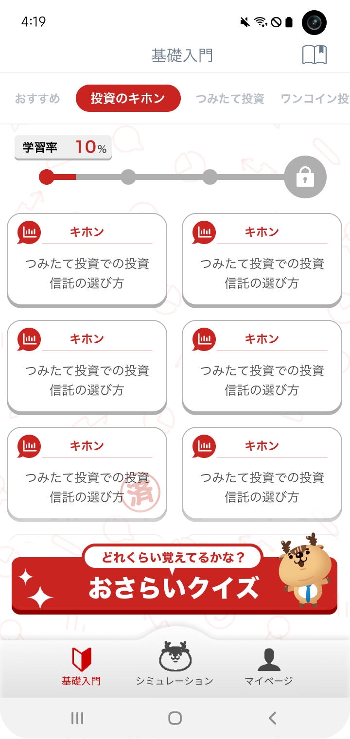
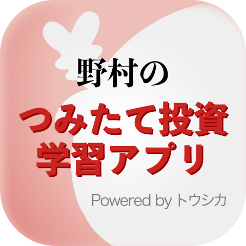
OEMプロジェクトの一環として、「トウシカ」の既存UIをベースに、野村證券向けの投資学習アプリをカスタマイズ・再設計しました。ブランドイメージや金融教育という目的に合わせ、視認性と信頼感のあるUI表現を目指しました。
主な実績:
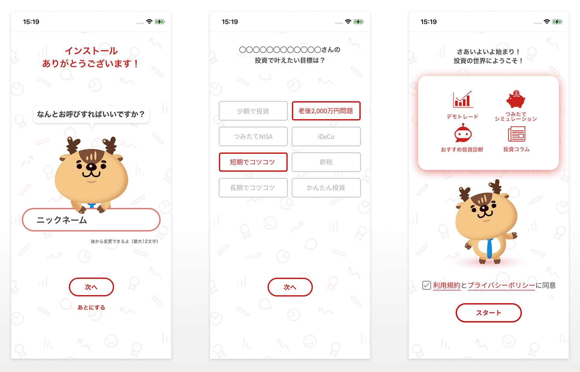
トウシカのUIコンポーネントとレイアウトを、野村證券のブランドガイドラインに沿って再構築
タイポグラフィ・配色・アイコンなどを調整し、よりフォーマルで信頼感のあるビジュアルトーンを実現
プロジェクトマネージャーと協力し、金融リテラシーを分かりやすく伝える設計を支援
As part of an OEM project, I redesigned and customized a learning-based investment app for Nomura Securities by adapting the existing UI from Toshika. The goal was to align the UI with Nomura’s visual identity and financial education focus, while maintaining usability and design consistency.
Key Accomplishments:
Reworked UI components and layout structures from Toshika to match Nomura’s brand guidelines
Adjusted visual elements such as typography, color schemes, and icons to establish a more formal and trustworthy tone
Collaborated with the project manager to refine the app’s content flow, ensuring it effectively delivered financial literacy concepts to users
Role
Freelance UI Designer
Duration
February 2023
Tools
Figma
Adobe Photoshop
Google Workspace
Scope
UIカスタマイズ
デザインシステムのローカライズ
ビジュアルデザイン
タイポグラフィとアイコン調整
ブランドガイドラインへの準拠
UI Customization
Design System Localization
Visual Design
Typography & Icon Adjustment
Brand Guideline Compliance
厳格なブランド要件に合わせて既存のデザインシステムをローカライズ・スケーリングする力が養われました。教育的な明快さと企業ブランドの信頼性の両立を意識したUI設計の重要性を実感したプロジェクトです。
This project strengthened my ability to localize and scale design systems to fit strict brand standards. It also deepened my understanding of designing UI that balances educational clarity with institutional credibility.