「まねらん」は初心者向けの投資学習・シミュレーションアプリで、UI全体の設計を担当しました。数ヶ月にわたり、プロジェクトマネージャーと連携しながら提案・修正を繰り返し、ブランドトーンに沿った親しみやすく分かりやすいUIを構築しました。
主な実績:
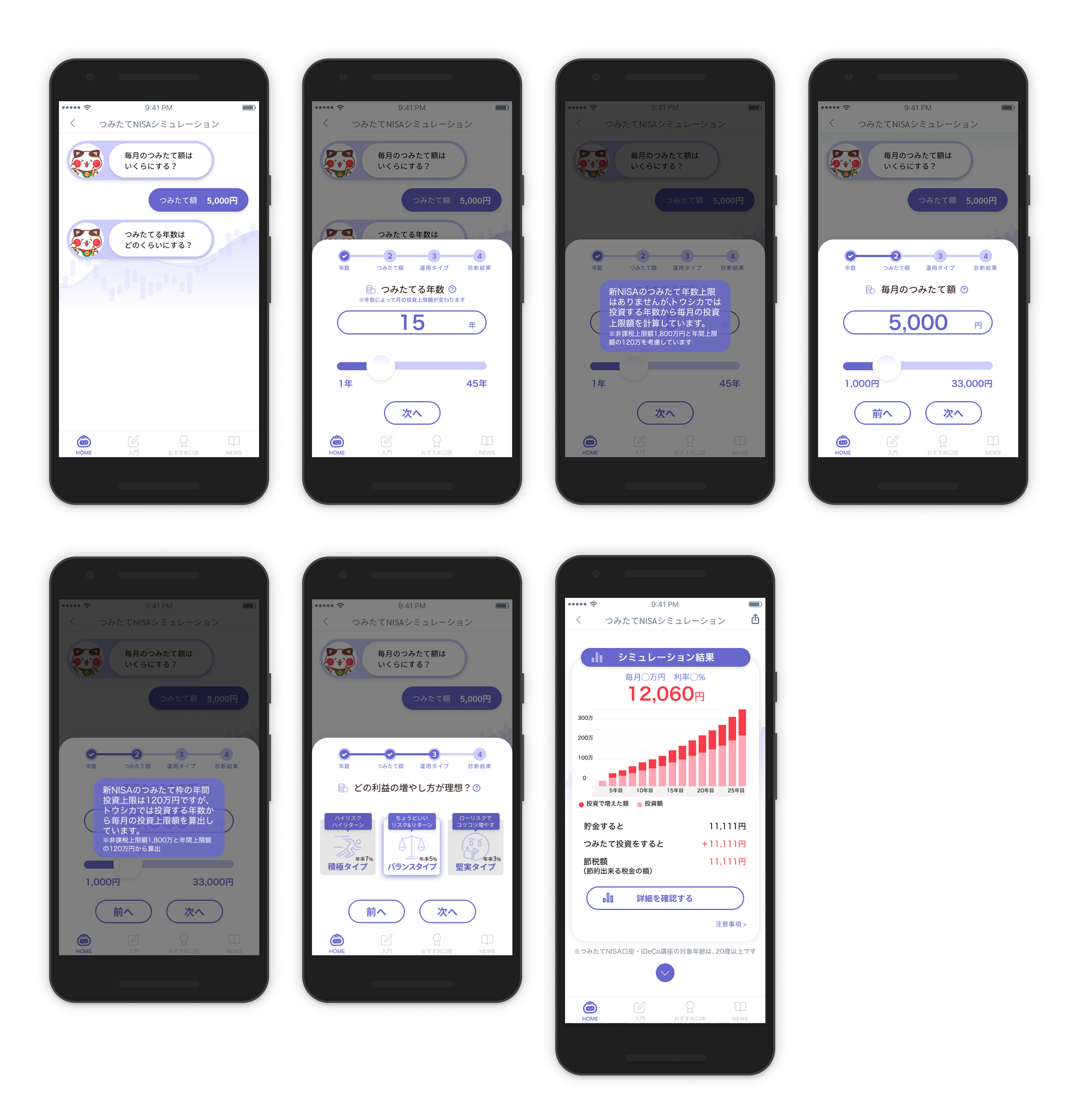
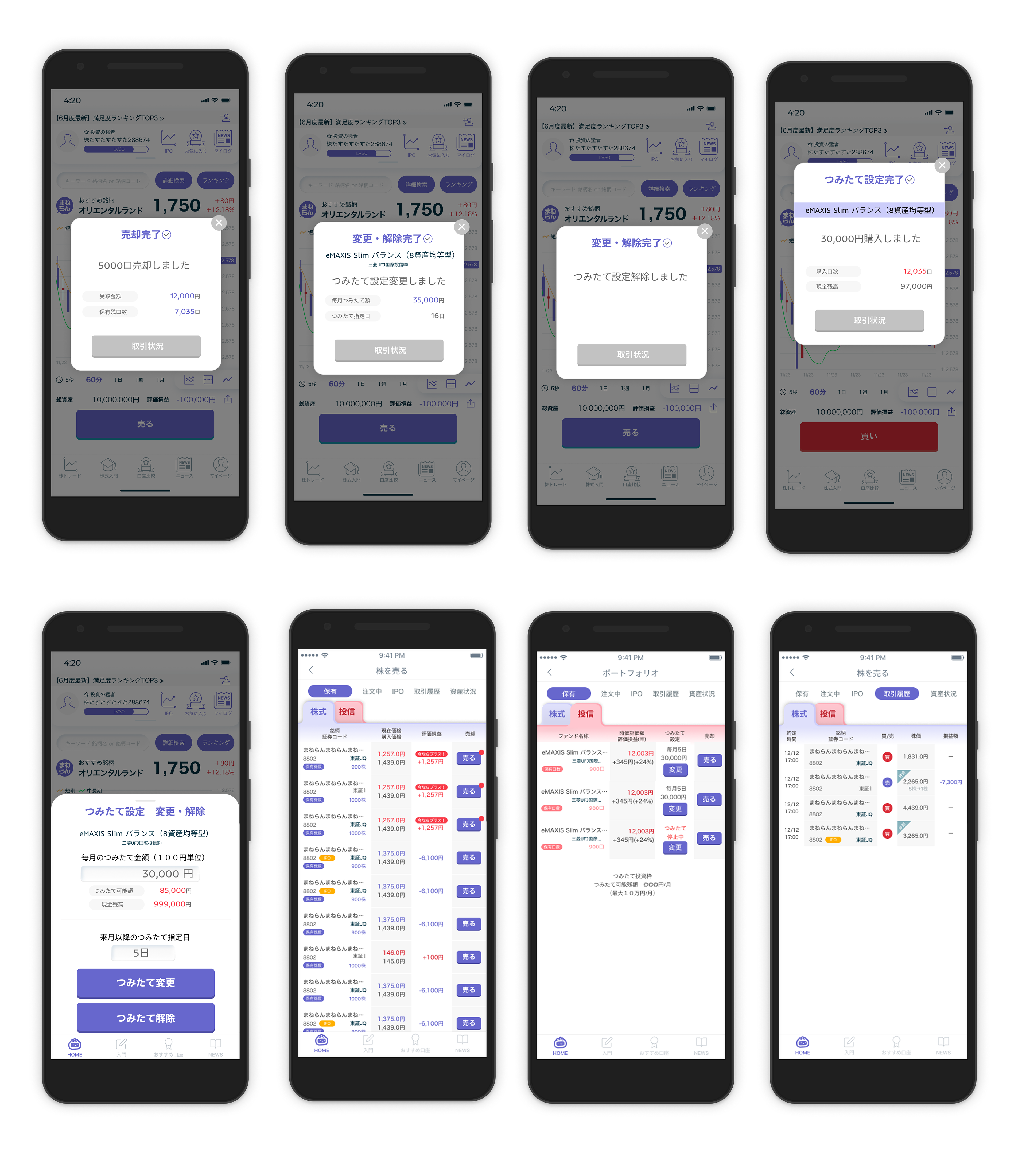
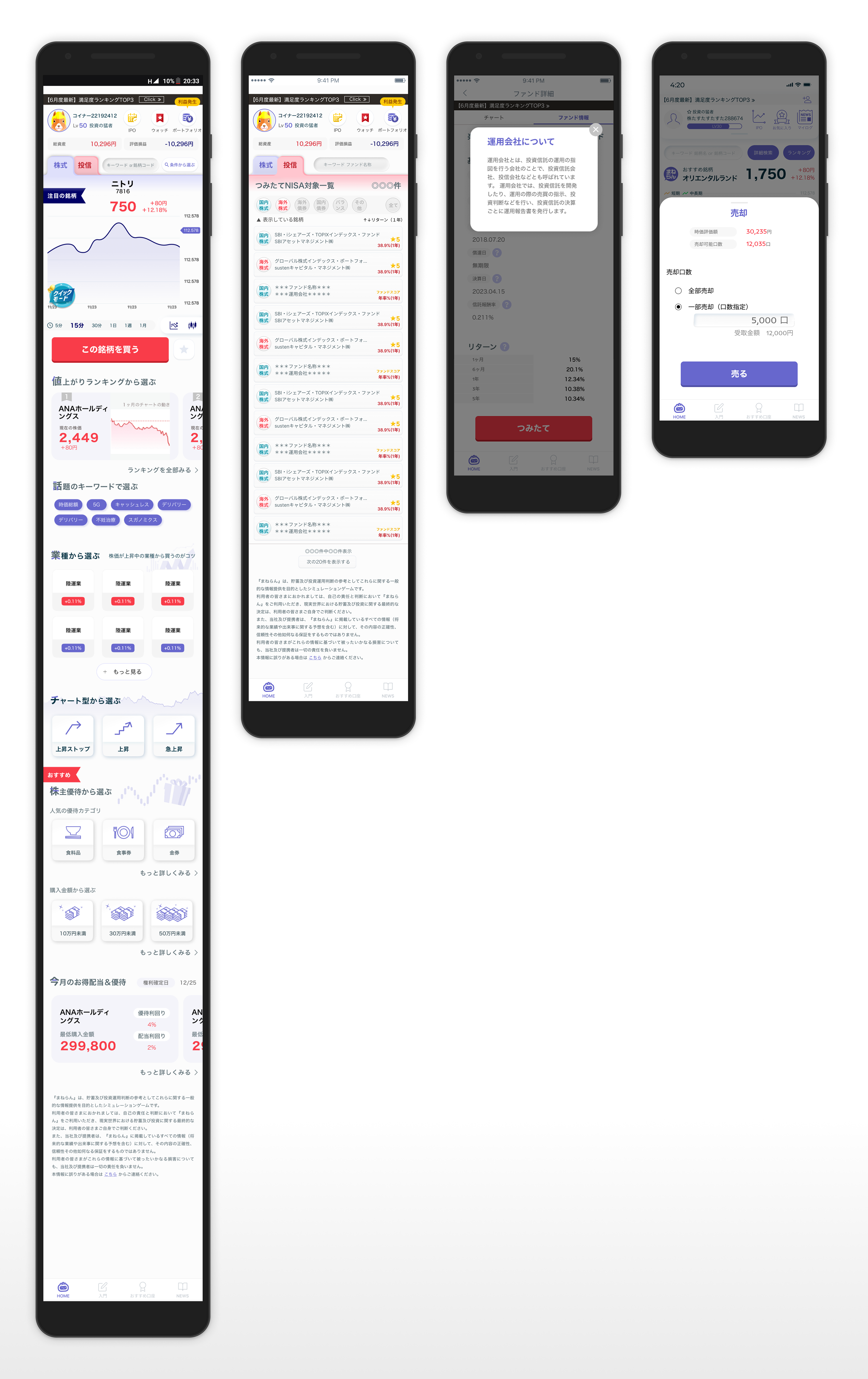
投資チャート、ファンド一覧、資産サマリー、購入・売却・つみたて設定など、主要機能のUIを設計
各種操作に対応するポップアップフローを設計(売却完了、つみたて設定など)
初心者でも理解しやすく、視認性の高いUIで、金融データの可視化と使いやすさを両立
ブランドトーンや既存サービスとの統一感を意識したビジュアルデザイン
I was responsible for designing the full UI of Maneran, an investment learning and simulation app for beginner investors. Over the course of several months, I worked closely with the project manager, iterating through proposals and revisions to create an interface that is informative, approachable, and aligned with the brand’s tone.
Key Accomplishments:
Designed key features including investment charts, fund listings, portfolio summaries, and flows for buying, selling, and automatic investing
Developed pop-up flows for user actions such as transaction confirmations and settings adjustments
Crafted a UI that combines data visibility and user-friendliness for first-time investors
Ensured visual consistency across the app by aligning with the brand tone and existing services
Role
Freelance UI Designer
Duration
July-September 2023
Tools
Figma
Adobe Photoshop
Google Workspace
Scope
アプリ全体のUI設計
金融UX構成設計
ビジュアルデザインとブランディング
ポップアップのインタラクション設計
モバイルユーザビリティ対応
Full UI Design
Financial UX Structuring
Visual Design & Branding
Pop-up Interaction Flows
Mobile Usability Design
複雑な金融情報をいかにわかりやすく、親しみやすいUIで提供できるかという点において、大きな実践経験を積むことができました。機能性・明快さ・安心感のバランスを意識した設計の重要性を改めて実感したプロジェクトです。
This project strengthened my ability to present complex financial information in a clear and friendly manner. It reinforced the importance of balancing clarity, function, and emotional comfort in fintech UI design.